Entering the Geospatial
Day 3 was dedicated to exploring mapping and geospatial technology.The use of mapping in the Digital Humanities centers around the layering of data to prove causality, make visual connections, or tell a story. We looked at many examples of maps that use meta-data (meaning the maps have clickable features or sidebars that provide additional information). Some include a map of famous authors who wrote in London. The user can explore a clickable London map to compare location references between authors or places where they lived/wrote. This allows the user to speculate on writing trends, inspirations shared between authors, etc.
Another example that is user-driven is Queering the Map. Queering the Map allows individuals to plot a point on a world map and tell a story of Queer love, Joy, or sorrow that took place there. It is a very powerful story-driven map that exemplifies the Humanity present in Digital Humanities.
Another very interesting mapping example follows an unlikly subject - smells! A study was conducted in Amsterdam to disprove that the city smells primarily of cannabis. The website states, “Over 650 smells were detected by 44 people undertaking 10 smellwalks over a period of 4 days in April 2013”
Aside from looking at mapping examples, we discussed the ethical importance of collecting geospatial data. We asked the following questions of ourselves as scholars: What is portrayed? Does it explore data and/or tell a story? Where does the data come from? Is it Open Source/accessible? Does it give value to the groups whose data contributed to the mapping? I think the last question is especially important because often when dealing with data from a particular place, researchers don’t take into mind making both the information and technology accessible to those users. For centuries, people of other cultures, religions, and races, (often non-western) have been exploited. It is essential in a digital age to repatriate the knowledge we get from others; whether that’s through creating a version of a data set in their native language or involving communities directly in research.
The two geospatial programs we toyed with were Recogito and StoryMap JS. Recogito functions by taking a primary text in the form of a txt. file and then has the user highlight and pin on a map all of the mentioned locations. Our class used Thucydides as our text. Our class manually selected the location words but there are codes to automate it, however, that process is not 100% accurate as many of the same location names exist in the world. Recogito, like many other Geographical Information Systems, use both points representig spesific longitudes and latitudes on a map, and Polygons represnting boundaries or city limits. Though time-consuming, Recogito is an excellent tool for visualization, is easy to use, and is also very practical pedagogically as students can work on mapping a text together and hold discussions about the importance of certain locations. Another easy mapping tool presented was Story Map JS. This tool combines elements of PowerPoint presentations and Google Maps, with many visual customization elements. It can be used to trace the life of a single author around the US or can be used to chronologically show all the locations mentioned in a novel.
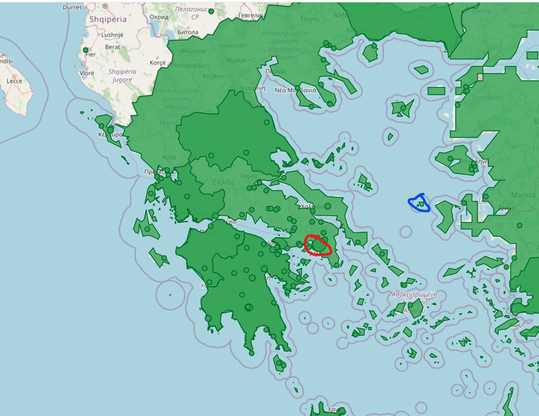
The red circle shows an example of what a point looks like on Recogito and the blue circle represents part of a polygon on the map. Notice how the polygon highlights the area in a color to show it is included in the greater location of Greece without a directly mentioned point like the red circle.