Networks and Image Clustering
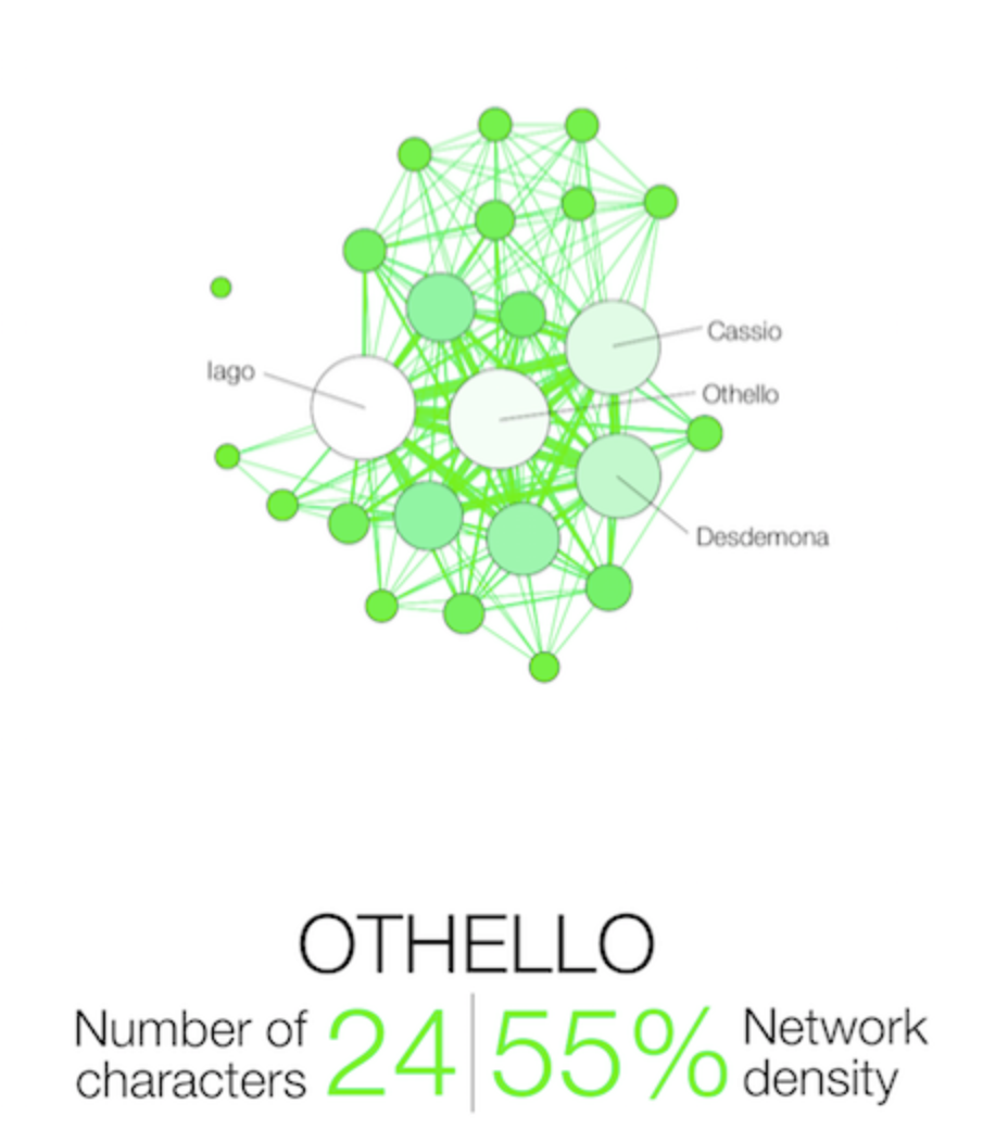
Day 4 began with network analysis which our group facilitator defined as “graphs as representations of relations between discrete objects.” A typical network graph consists of Nodes (representing all separate entities) and edges (the defined relationship that connects entities to one another). As a class, we examined two different network data sets pertaining to character interactions in literature/television. The first was a fully formed network data set by Martin Grand Jean that abstracted character interactions in Shakespeare’s Tragedies. It is essential that in a network data set, the creator must clearly define the connecting pieces. It can be when two characters talk directly, when both are on stage simultaneously or when one is talking about the other. Some uses of Network analysis include determining centrality- are they the central characters? How is their presence structured? It also can be used as a tool to examine gender and race inequality in stories- how central are women and POCs in a narrative? Do they interact with one another or are they used to further the plot of leads?
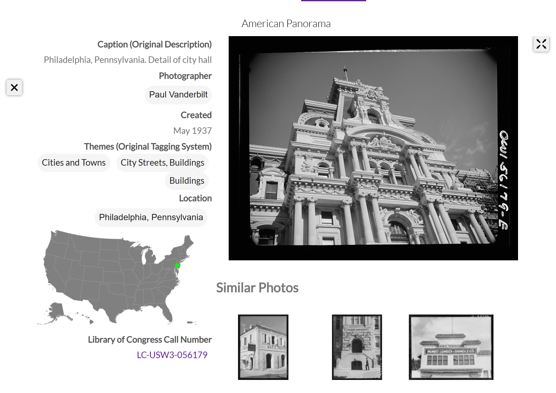
The afternoon of day 4 centered around Image Clustering and Analysis- looking at how computers classify and sort images. The website Photogrammar provided a good baseline on how images can be clustered. The site takes archival photographs commissioned by the 1935- 1944 Farm Security Administration and the Office of War Information to highlight American living during the Great Depression and WWII. The site categorizes pictures by photographer, location, work, social activity, landscapes, transportation, cities and towns, homes, and people. Within categories are subcategories. For example, by clicking on work, you may then narrow it down to farming, and then further to the farming of corn. This site was used to show how clustering algorithms function and the different types of sections formed from visual data.
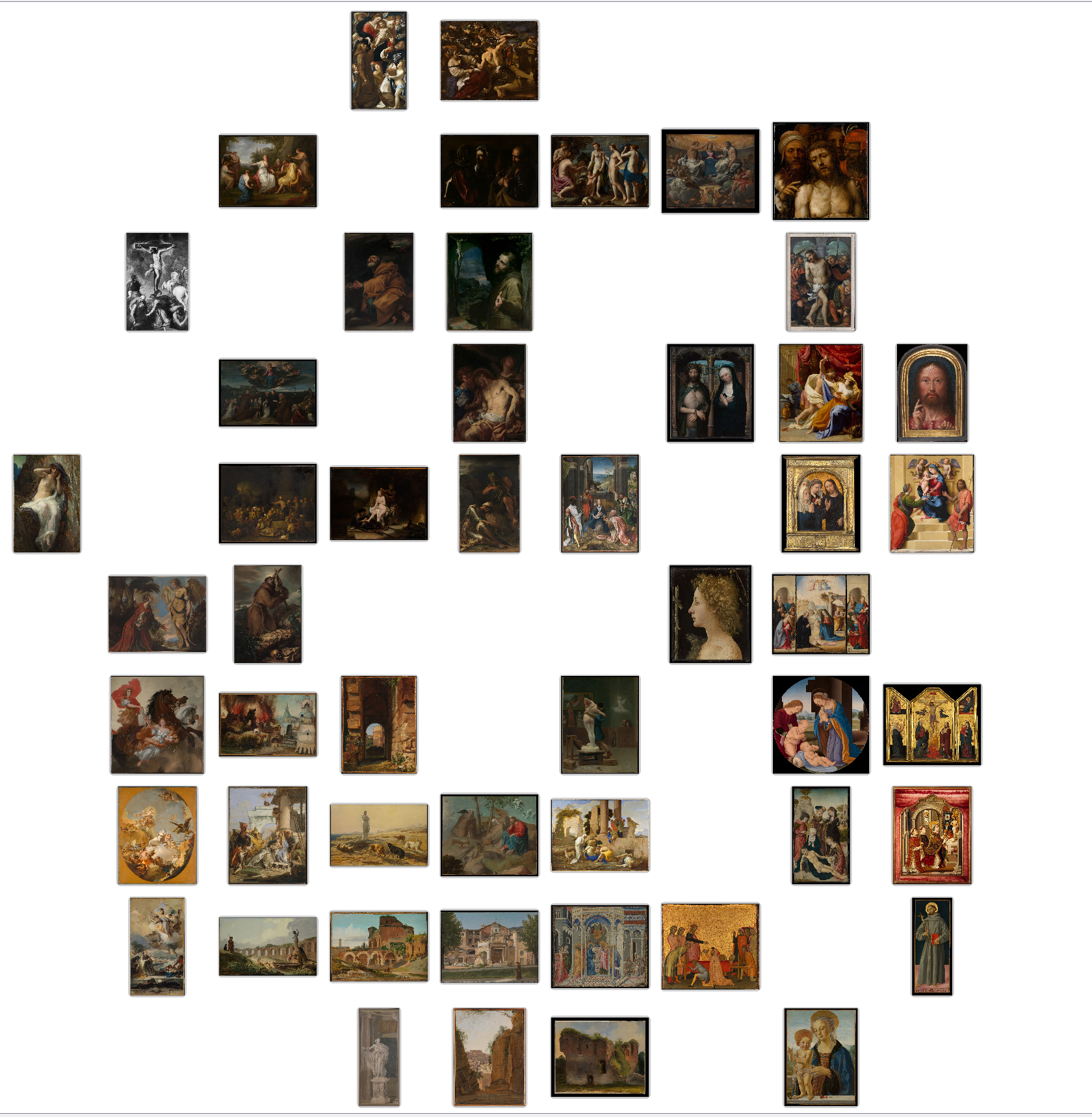
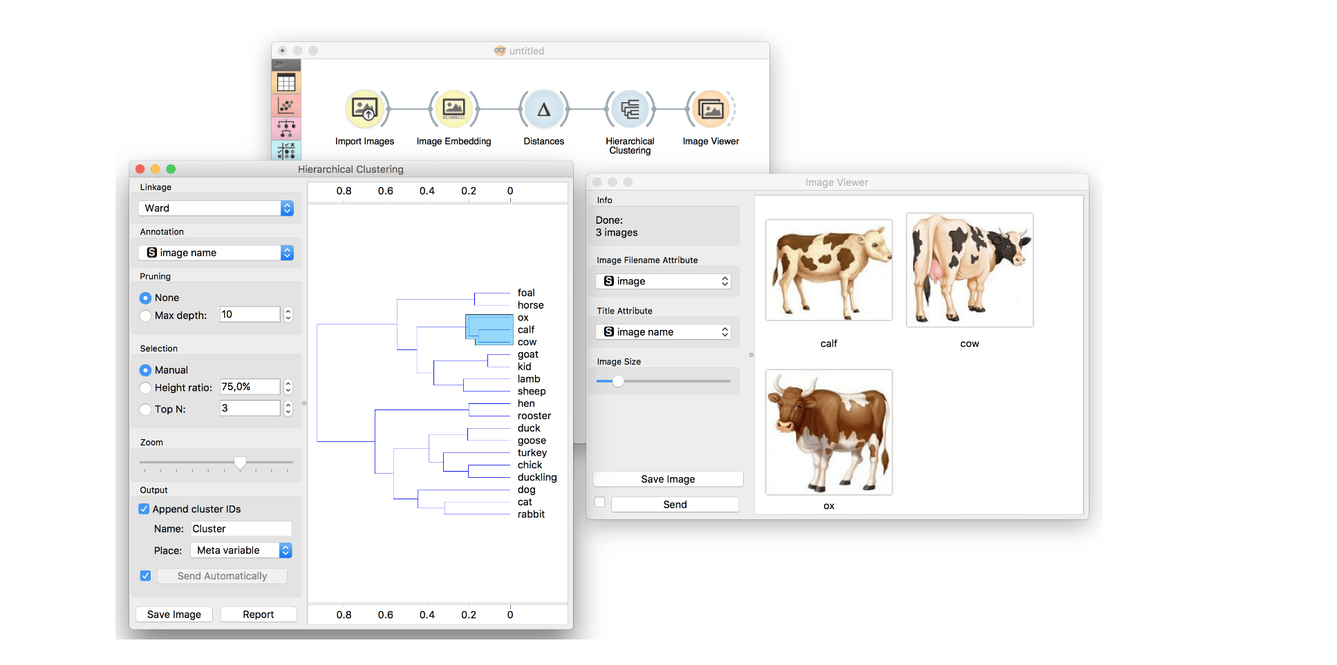
Our hands-on lesson required compiling 30-50 images that have similar themes or visual elements. I uploaded the images to a program called Orange. Orange uses machine learning to group images based on similar visual clues. The example image shown below shows how different animals were grouped based on things like color, size, shape, and pattern that the computer can recognize from being shown thousands of training images from different sources (such as Google images, archives, facial recognition sites).
For my project, I chose to use around 35 paintings from the Metropolitan Museum of Art tied to classical antiquity-with imagery or context involving the Romans/Greeks/or early Christ. The results varied based on the different data sets being used. The Google V3 data, for example, seemed to be the most thematic and detailed clustering as it was able to recognize and group together images showing the suffering of Christ. Other data sets recognized things such as a set of paintings that all had a gold frame, a set of landscapes, and number of people depicted, and shadows. Orange is very practical in the fields of History, fine arts, and museum studies. Orange can be used to pick out visual themes and messages in political propaganda through its clusters or to see how the works of a single artist may differ in style. It is also just fun to mess around with! Perhaps you could take pictures of yourself and see how it clusters based on facial expressions or lighting or style!
Cluster based on Google Machine Learning:
 image classification.png)
Cluster based on Painting/Archival Training